We're all back after a month of break :)
We are having Ms Lisa as our lecturer for this sem 2 again :D But this time she is lecturing and giving knowledges about 2 Dimensional Design.
On the first class, Ms Lisa gave us a brief and our assignment topic as always. It is paper cut out again, but a little different this time. We were told to do both symmetrical and asymmetrical like last time but this time with a square only. It is the expansion of the square. This exercise is to let us understand the interaction of positive and negative space. This task might seem easy to be carried out but no. It took a lot of thinking to balance both the positive and negative space. Composition is very important. It is easier to design the symmetrical cut out because it creates both the positive and negative space with the same object after expansion. However asymmetrical is more challenging because it was not supposed to be same once it is expanded. It will look more interesting and it requires more thinking and effort to balance and compose.
My theme for this task is "Ship".
As usual, we must do researches and sketches before being approved. It took a while for me to do the researches and modifying the ships to make them more interesting. Please stay tuned for more on the next post :)
Monday, 25 November 2013
Tuesday, 20 August 2013
Final assignment! Greeting Cards
After the big project, Miss Lisa was nice enough to give us a rest. We had an online tutorial instead of going to class. This really helped me because I don't have to get up so early to go to school. :3 On the online tutorial, Miss Lisa wrote down what we were supposed to do for the final assignment. It was to design and create 3 greeting cards. We were told to make 3 cards with different occasion with just a kind of theme. I decided to use pixel cartoon as my theme. The occasions chosen by me was a Christmas card, a birthday card and a Halloween card. I used Photoshop to draw these cartoon and typography myself. I did some research and also watched videos in youtube on how to draw them in Photoshop. It took me some time to draw them because I am still new to it. After drawing, I printed them out and stick them on the cards.
These are the photos taken to show the progress of making these greeting cards


These are the photos taken to show the progress of making these greeting cards
.
.
.
The outcome!
After presenting, I really appreciate every advices Miss Lisa had gave me. Oh ya! Today was the last class of the principle of design. For this, I would really like to thank Miss Lisa because I had learned a lot of knowledge about designing. I will listen to her advices and adjust my standard to what a real designer should be. :D
Wednesday, 14 August 2013
Hue assignment :)
Few weeks ago, Miss Lisa gave us a talk about hue. After that, we were given an assignment, one of the biggest project that I have to do in life. We were tasked to make a model to float on the lake or the pond near our POD room. We were also told design the model in hue.
After awhile, we were all divided into groups. I am glad to be in the group with Nick, Nicholas, Dzauqi and Nabila. Right after that, we discussed about what we want to make as the model. At first, we thought of making 8 tentacles with a colourful hue but in the end we find it too hard to be supported and float in the lake so we were forced to forfeit that idea.. :/ In the end, we decided to make a submarine with hue, and we named it the "Huemarine". Then, we were missioned to make a small model to present it on the following week during class.
 |
| The mini model of the model. (iceberg only) |
 |
| The sketch of the submarine. |
For the body of the submarine, we used chicken wires. While for the icebergs around the submarine, we used styrofoam. We also added lights around the submarine to making it more outstanding. Now, I would like to let the pictures talk.
 |
| The submarine. (after colouring) I forgot to take picture of the one before we did the colouring. |
 |
| Us staying overnight at the campus to do the submarine. |
 |
| After adding the icebergs (styrofoam) around the submarine and then added bamboos and a few pieces of styrofoam to allow it floats on the lake or pond. |
 |
| Our Huemarine taken by me :D |
 |
| Models of ours and the other groups :) |
 |
| Our group photo :D |
 |
| Huemarine with the lights on! It looks much cooler right? |


Although it was hard and it took us some time to put them into the pond but we still managed to float it on the water without any damage done to our Huemarine. If you look properly into the photos, you can see some white mist or smoke on the pond. It is thanks to one of my group members, Dzauqi that gave an idea to put dry ice on our model while floating on the water. It managed to give our Huemarien a fantastic effect on visualing!
 |
| All the models on the pond! |
 |
| After editting :D |
Tuesday, 25 June 2013
Introduction to colour
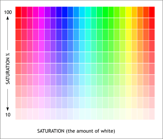
Definitions:


.gif)


Hue
- An element of the color wheel
- One of the main properties of a color
- Refers to a pure color in painting color theory - one without tint or shade

Value

- Lightness or darkness of color, sometimes called tone.
- A property of a color or a dimension of a color space.
- More white to hue, brighter the value; vice versa
- Colorfulness of a color relative to its own brightness
- Related to colorfulness and chroma in colorimetry and color theory
- Purity of a hue
- The more the gray a color contains, the less saturated it is
 |
|
|
Secondary Color
- Mixture of two primary colors in a given color space.
- Red and yellow = orange, yellow and blue = green, red and blue = purple.
- Depends on the proportion in which you mix the two primaries.

Tertiary color
- A tertiary color is a color made by mixing either one primary color with one secondary color, or two secondary colors, in a given color space such as RGB ( more modern ) or RYB ( traditional ).
- RYB uses pigments, similar to CMY, which combine subtractively by absorbing light. Thus, combining colors using the RYB system will result in a darker color.
- Additive secondaries - Light (RGB)
red (●) + green (●) = yellow (●) green (●) + blue (●) = cyan (●) blue (●) + red (●) = magenta (●)
- Subtractive secondaries - Pigment (CMY) [CMYK's "K" stands for Key (usually black)]
cyan (●) + magenta (●) = blue (●) magenta (●) + yellow (●) = red (●) yellow (●) + cyan (●) = green (●) - Traditional painting (RYB)
RYB colors: primary (roman) and secondary (bold)
yellow
orange
red
purple
blue
green
yellow
Analogous color
- Analogous colors are groups of colors that are adjacent to each other on the color wheel, with one being the dominant color.
- Which tends to be a primary or secondary color, and two on either side complimenting, which tend to be tertiary.

http://www.photographyicon.com/analogous/
Tint
- A tint is the mixture of a color with white, which increase lightness.
Shade
- A shade is the mixture of a color with black, which reduces lightness.

http://www.gefielder.com/images/m-Shade-color-and-shadowlg.jpg
Monochromatic color
- Monochromatic colors are all the colors (tints, tones and shades) of a single hue.
Warm color
- Warm colors are often said to be hues from red through yellow, browns and tans included.
- Appear more active in painting.

Cool color
- Cool colors are based on blues, greens, pinks, purples, blue-greens, magentas, and true "blue-based" reds.

Regal

Freshness
Joy

Passion

Friday, 21 June 2013
Another new assignment!
Symmetry and Asymmetry!
Helloooo! It has been awhile :D I was so busy lately with all the assignments. Two weeks ago, Miss Lisa gave us another assignment and it was about symmetry and asymmetry. So.. what does those two means ? Symmetry means the left side and right side of an image that is proportional to each other, like mirror image. While asymmetry is the opposite of symmetry, which is more unbalance.
After the explanation, she gave us the title of assignment, which is paper cutout! We were told to do 2 paper cutout, which was based on what we had just learned, symmetry and asymmetry. We were given a week to complete the cutout because there was a week of holidays (sem break). For the cutout, each of us were told to have a subject matter. At first, I wanted it to be "Dragon", but then I changed my mind. I'd changed to "Tattoo".
This assignment took me a lot of time to finish it. I did it slowly and carefully so that it won't destroy my cutout and shapes. It was very very tiring and my neck hurts a lot after doing it :/ but the feeling of completing a cutout I did myself healed my neck immediately hahahaha. I used a pen knife from Daiso to do the cutout because my blade is too big to cut the small spaces. Miss Lisa suggested us to try it and I didn't regret it hahahaha.


.
.
.
.
Tadaaa~


Helloooo! It has been awhile :D I was so busy lately with all the assignments. Two weeks ago, Miss Lisa gave us another assignment and it was about symmetry and asymmetry. So.. what does those two means ? Symmetry means the left side and right side of an image that is proportional to each other, like mirror image. While asymmetry is the opposite of symmetry, which is more unbalance.
After the explanation, she gave us the title of assignment, which is paper cutout! We were told to do 2 paper cutout, which was based on what we had just learned, symmetry and asymmetry. We were given a week to complete the cutout because there was a week of holidays (sem break). For the cutout, each of us were told to have a subject matter. At first, I wanted it to be "Dragon", but then I changed my mind. I'd changed to "Tattoo".
This assignment took me a lot of time to finish it. I did it slowly and carefully so that it won't destroy my cutout and shapes. It was very very tiring and my neck hurts a lot after doing it :/ but the feeling of completing a cutout I did myself healed my neck immediately hahahaha. I used a pen knife from Daiso to do the cutout because my blade is too big to cut the small spaces. Miss Lisa suggested us to try it and I didn't regret it hahahaha.
Process, materials and tools :D
.
.
.
Tadaaa~
Some of you might think I printed them out first before I cut them but I only thing I printed out is the grey body. I draw lines on the grey body and cut them out, after that stick it on a green paper.
Ohh.. and on the day we were suppose to do the presentation of our paper cut out, which was on Wednesday 19th of June.. I couldn't make it because of my stomach =.= Something was wrong with my stomach on that week. I wasn't quite feeling well, maybe because of the haze. I'm so sorry Miss Lisa.. :(
I will end it here, I'll post again soon if I'm free :D
I will end it here, I'll post again soon if I'm free :D
Thursday, 30 May 2013
New assignment!
Hellooooooo! I'm finally back to the blog now to write about my second assignment of POD (Principles Of Design). :p
My second assignment is about cropping and composition. We were told to choose one subject matter and I chose "Textures and Patterns" by cropping on walls, floors, tiles and more. Before our lecturer, Miss Lisa gave this assignment to us, she explained about composition of an image. That day, we also get to cut a mounting board in order to make a frame. This is because we needed to use a frame to crop and compose our photo shots. Basically the frame is our view finder and cropping tool for this assignment.
For the tutorial, we were required to shoot 50 shots at minimum and choose 30 of them only after showing our lecturer, Miss Lisa. We also needed to make our own videos of the pictures we took! :o
I took some pictures from the campus but it wasn't enough so I decided to go to Sunway Pyramid for more shots with my friends. We walked almost everywhere in there with the frame on our hands. It was so awkward hahahaha. Although I am not very sure that were there anyone looking at me, but I can feel them looking at me xD. After that, I started to make the video. Although it was my first time making a video but it wasn't that hard, it only takes time.
At first I thought my subject matter is boring because it didn't have any story like the others and mine are just plain patterns and textures :/ But at least Miss Lisa said she likes it hahahaha. From this assignment, I've learned a lot about composition and the way to crop because different placements give different effects and styles. And also.. I mastered the skill on how to hold the frame properly hahahaha it was very hard to hold the frame straight while taking pictures. :|
These are some of the pictures and the video I made for the presentation.


My video :D
Subscribe to:
Comments (Atom)